


Wada Morihiro 和太守卑良 1944-2008
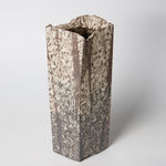
Vessel “Hassan-Mon-Ki” 発彡文器, 1992
Stoneware
H14.0" x W5.1" x D5.3"
H36.0 x W13.2 x D13.5 cm
H36.0 x W13.2 x D13.5 cm
With Signed Wood Box
Further images
-
(View a larger image of thumbnail 1
)

-
(View a larger image of thumbnail 2
)
-
(View a larger image of thumbnail 3
)

-
(View a larger image of thumbnail 4
)

-
(View a larger image of thumbnail 5
)

-
(View a larger image of thumbnail 6
)

-
(View a larger image of thumbnail 7
)

-
(View a larger image of thumbnail 8
)

-
(View a larger image of thumbnail 9
)

-
(View a larger image of thumbnail 10
)

-
(View a larger image of thumbnail 11
)

-
(View a larger image of thumbnail 12
)

-
(View a larger image of thumbnail 13
)

-
(View a larger image of thumbnail 14
)

Wada Morihiro wrote about the creation of this series: The 'San-Mon' series of works seems to have found a direction of expression using the clay as a material. My initial...
Wada Morihiro wrote about the creation of this series:
The "San-Mon" series of works seems to have found a direction of expression using the clay as a material. My initial intention was to cover the entire form of the vessel with detailed patterns, so that the patterns themselves would become the material. It is the accumulation of marks caused by individual habits, and the process of turning these actions into material is the work of making things. The idea that the pattern is a tool for cutting out the form was born at this time.
The San-Mon pattern began as a detailed sketch of a cedar tree, but it eventually transformed itself in accordance with my own way of thinking, and became like my own writing style. The pieces that started out as San-Mon-Ki 杉文器 came to be called San-Mon-Sekki 杉文炻器 , and those whose appearance was altered by the addition of white or black clay were called Saido-San-Mon 彩土杉文. The word "Saido" 彩土 was coined from the Japanese word "Saido,"再度 which means "Once again," and I am amused to see the word "Saido" being used here and there afterwards.
The Saido-San-Mon 彩土杉文 pattern was tried in a variety of forms, including round, wavy, and angular, but eventually, by defining the directionality of the pattern, the form came to show two symmetrical angles.
One is called Ryu-San-Mon 流彡文 a flowing pattern with undulating curved surfaces and somewhat animal-like shapes, and the other is called Hassan-Mon 発彡文 a sharply angled pattern with a linear divergent direction. At that point, the character for San 杉 was changed to "彡. I tend to prefer to use letters that describe abstract states in the names of my works rather than letters that describe specific things. This is because I don't want the viewer to be caught up in the specificity of the letter. The character "彡" has the meaning of an element that is the source of various representations, and I am happy to have discovered this very simple character, which I like."
土という材質による表現方法に一つの方向を見出したように思ったのが杉文のシリーズである。 最初の意図は細かな文様が器形全体を蓋い、文様そのものが材質となることだった。それは個人の癖による痕の集積であり、その行為が材質化してゆく過程がモノを作るという作業である。 文様は形を切り出すための道具であるという考えはこの時生まれた。杉の細部のスケッチからはじまった杉文だったが、やがて私の癖のままに変形してゆき、私自身の字体のようになってしまった。 杉文器として出発したものは杉文炻器と呼ぶようになり、白や黒の土を加えることで容貌が変化したものを彩土杉文と名づけた。 再度という音をもじって彩土とつけたのだが、その後あちこちで彩土という言葉が使われるようになり面映ゆい思いがしている。
彩土杉文は丸やかな形、角ばった形と色々試みたが、 やがて文様の方向性を明確にすることによって形態も対称的な二つの方角を示すようになる。
曲面がうねり、 どこか動物的な形を思わせる流彡文と 直線的な発散性方向を持ち鋭角な発彡文である。 その時点で杉の字を彡に変えた。 具体的な物を示す文字よりも、 抽象的な状態を表す文字を作品名に使うのを好む傾向がある。 文字の示す具体性に、見る方にとらわれてもらいたくないためである。 彡という字には様々な表象の元となる要素といった意味があり、このきわめて単純な字の発見は嬉しく、 私が気に入っているものである。